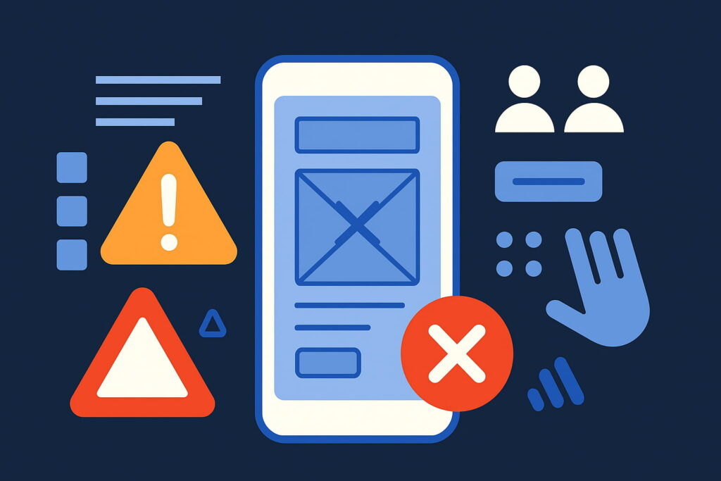
When it comes to mobile apps, user experience (UX) can make or break your product. A beautifully designed interface is not enough—users expect intuitive navigation, fast performance, and seamless usability. In fact, a poor UX is one of the top reasons users uninstall an app after just one use.
Whether you’re designing your first app or refining an existing one, avoiding key UX mistakes can significantly improve user satisfaction and retention. Let’s walk through some of the most common mobile UX design pitfalls—and how to steer clear of them.
1. Overloading the User Interface
The Mistake: Trying to show everything at once—buttons, banners, popups, features—on a single screen.
Why It’s a Problem: Cluttered interfaces overwhelm users. It increases cognitive load and makes it hard to focus on what truly matters.
How to Fix It:
- Prioritize content and functionality.
- Follow a minimalist design approach.
- Use progressive disclosure—show advanced options only when needed.
2. Ignoring Platform Design Guidelines
The Mistake: Creating one-size-fits-all designs that ignore differences between iOS and Android.
Why It’s a Problem: Each platform has its own design language (Material Design for Android, Human Interface Guidelines for iOS). Ignoring these leads to inconsistent experiences and confused users.
How to Fix It:
- Follow native platform guidelines.
- Respect platform-specific navigation patterns and gestures.
- Use platform-specific UI components wherever possible.
3. Poor Onboarding Experience
The Mistake: A long-winded or confusing onboarding process—or worse, no onboarding at all.
Why It’s a Problem: First impressions matter. Users often drop off if they don’t understand how to use the app right away.
How to Fix It:
- Keep onboarding short and optional.
- Use interactive walkthroughs or tooltips.
- Highlight only essential features users need to get started.
4. Small Touch Targets and Tight Spacing
The Mistake: Buttons and icons are too small or too close together, making them hard to tap.
Why It’s a Problem: This frustrates users and leads to accidental taps—especially on smaller screens.
How to Fix It:
- Follow touch target size guidelines (at least 44×44 pixels).
- Maintain ample spacing between clickable elements.
- Test for usability across different screen sizes.
5. Inconsistent Navigation
The Mistake: Non-standard navigation menus or mixing navigation patterns (like combining tab bars with hamburger menus).
Why It’s a Problem: Users struggle to find what they need if the app’s navigation doesn’t follow familiar patterns.
How to Fix It:
- Use intuitive and consistent navigation.
- Stick with standard UI patterns users are already familiar with.
- Ensure back and forward flows are logical and predictable.
6. No Loading States or Feedback
The Mistake: Users tap a button, but nothing happens. No loading spinner. No confirmation. Just… silence.
Why It’s a Problem: This leads users to think the app is broken or unresponsive.
How to Fix It:
- Show activity indicators or skeleton screens during loading.
- Use animations or subtle microinteractions to confirm actions.
- Provide clear success and error messages.
7. Bad Typography and Low Contrast
The Mistake: Fancy fonts, tiny text, or poor color contrast.
Why It’s a Problem: Reduces readability and strains the eyes—especially in different lighting conditions.
How to Fix It:
- Use clean, legible fonts and proper font hierarchy.
- Ensure color combinations pass contrast accessibility tests.
- Allow users to adjust text sizes if possible.
8. Not Designing for All Screen Sizes & Orientations
The Mistake: Designing only for one device or orientation (like iPhone portrait mode).
Why It’s a Problem: The app may break or display poorly on tablets, larger phones, or in landscape mode.
How to Fix It:
- Use responsive design principles.
- Test across various screen resolutions and aspect ratios.
- Allow flexible layouts that adapt to different device orientations.
9. Neglecting Accessibility
The Mistake: Not accounting for users with disabilities—no screen reader support, poor color use, no alt text.
Why It’s a Problem: You exclude a significant portion of your potential audience.
How to Fix It:
- Support screen readers and voice navigation.
- Avoid using color as the only indicator for action or feedback.
- Include accessibility labels for interactive elements.
10. Feature Creep Without User Validation
The Mistake: Adding more and more features without considering whether users actually need them.
Why It’s a Problem: Bloated apps are harder to use and maintain. Too many options = decision fatigue.
How to Fix It:
- Use analytics and user feedback to guide feature development.
- Prioritize features that align with user goals.
- Regularly conduct usability testing and surveys.
Final Thoughts
User experience isn’t just about clean visuals—it’s about making your app easy, enjoyable, and accessible for everyone. Avoiding the mistakes above will help you create a mobile app that users love coming back to.
Remember: A great UX feels invisible. It gets out of the user’s way and simply works.